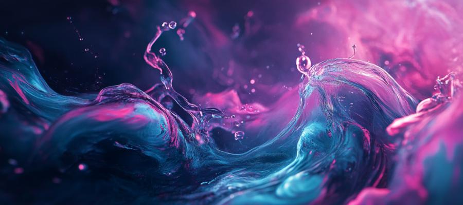
Why Liquid Design?
You might be wondering: Why are designers trying to turn websites into something that behaves like a river? Because the internet has become an interactive space, where users expect more than just static visuals. Clicking a button shouldn’t feel like you’re tapping a brick. With liquid design, sites breathe and evolve based on how you interact with them. When you scroll, hover, or click, the elements on the page don’t just sit there—they morph and glide, like ripples on a pond after you toss a stone.Think of it this way: Water doesn’t have a set shape; it conforms to whatever environment it finds itself in. A website that can do that? Now that’s futuristic.
Fluid Grids: No More Boxes
For a long time, web design was like playing with Legos. You had your blocks (divs, to be technical), and they snapped into place rigidly. But liquid design says no more to these hard edges. Fluid grids are at the heart of this movement, allowing elements on a page to flex and flow based on user input or screen size. This means when you resize your browser or access the site on different devices, the layout stretches, shrinks, and adjusts, just like water filling up different shaped containers.The best part? Fluid grids don’t break. They might bend and reshape, but unlike a pixel-perfect layout, they won’t leave awkward gaps or spill over the edges. It’s all about balance—letting your content move freely without ever feeling out of control.
Dynamic Transitions: Ebb and Flow
If you’ve ever experienced the visual thrill of a perfectly timed hover effect or an elegant scroll-triggered animation, you already understand the power of dynamic transitions. In liquid design, transitions don’t just happen—they flow. Think of it as the difference between stepping into a cold pool and diving into a perfectly heated one. One is jarring; the other is smooth.Liquid design incorporates these seamless transitions to ensure that users glide through the website experience. Whether it’s a menu that expands like a rising tide or a photo gallery that unfolds like waves washing ashore, the goal is to keep the user engaged in a way that feels natural, not forced. After all, nobody enjoys a website that slams into place like a rusty garage door.
User Interaction: Stirring the Waters
One of the most exciting aspects of liquid design is its responsiveness to user interaction. Much like the way water reacts when you touch it—whether by rippling, splashing, or forming into droplets—liquid design sites respond dynamically to the user’s actions. Hover over a button, and instead of a static color change, you might see a ripple effect spread across the surface. Click on a link, and the surrounding content might shift and swirl out of the way, clearing a path for the new page to flow into view.This kind of interaction creates a sense of engagement that goes beyond simply moving a cursor across the screen. It’s almost as if the website is alive, reacting to your presence in real-time. The effect? Users stay longer, click more, and leave with a better sense of connection to the content.
Natural Fluid Dynamics: Where Science Meets Design
To fully appreciate liquid design, it’s worth diving into the science behind it—specifically, fluid dynamics. Water flows in fascinating ways: it finds paths of least resistance, forms intricate patterns, and moves in response to forces applied to it. Web designers, inspired by these principles, are creating websites that mimic the same kind of organic flow.Incorporating ideas from fluid dynamics into a site’s architecture means that designers are building experiences where no element feels isolated. Instead, everything connects and interacts with a sense of flow. When a user interacts with one part of the site, the effects ripple outward, influencing other elements in subtle ways. This not only makes the website more engaging but also fosters a holistic user experience where nothing feels out of place. It’s like watching a river run its course—every part works in harmony with the whole.
Fluidity Without the Flood
Now, before you start envisioning websites where everything is sloshing around like a hyperactive washing machine, let’s be clear: liquid design doesn’t mean chaos. Fluid doesn’t equal random, and it definitely doesn’t mean you’re designing a site that feels like you’re navigating a tsunami.The best liquid designs are controlled, strategic, and intentional. They offer fluidity but within carefully crafted boundaries. The goal is to guide the user, not leave them drenched in confusion. Just as a river follows a path carved over centuries, liquid design is all about creating flow while maintaining structure. The end result is a design that’s adaptive but not overwhelming, dynamic but not distracting.
The Future of Web Design: Surfing the Liquid Wave
As technology continues to evolve, we can expect liquid design principles to grow even more sophisticated. With the rise of augmented reality (AR), virtual reality (VR), and advanced interaction technologies, the web will soon be a place where users don’t just interact with static pages but experience immersive, flowing environments. Picture a site where navigation feels less like clicking through a file directory and more like moving through a living, breathing space.Of course, it’s not all about flashy animations and show-stopping effects. The ultimate goal of liquid design is to improve the user experience by creating websites that feel intuitive and natural. Whether it’s a blog, a portfolio, or an e-commerce platform, the idea is to make every interaction as seamless as water flowing downstream. And who wouldn’t want to surf a wave of that kind of progress?
Wrapping It Up: A Fluid Finish
Liquid design isn’t just a trend—it’s a reflection of where web design is heading, with an emphasis on adaptability, responsiveness, and user engagement. Websites are no longer static pages of text and images. They’re interactive environments that should feel as alive and responsive as the users navigating them.So, next time you’re thinking about redesigning your website, consider giving it a splash of fluidity. Your users will appreciate the smooth, engaging experience—just be sure to keep the towels handy.
Article kindly provided by odysseynewmedia.com