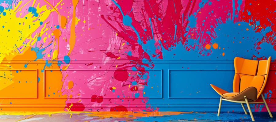
When it comes to color, even the best intentions can result in a kaleidoscope of confusion. From fashion faux pas to design disasters, the misapplication of color theory has led to some truly unforgettable visual experiences. Here’s a tour through some epic fails in color theory, exploring how and why these chromatic catastrophes occurred.
A Homeowner’s Neon Nightmare
Imagine the excitement of buying your first home. You have visions of creating a warm, welcoming space, a sanctuary from the outside world. Eager to make a bold statement, you decide to paint the living room. The choice? A vibrant shade of neon green. As the last stroke dries, your heart sinks. The room doesn’t say ‘chic and lively’ as much as it screams ‘emergency exit’. The aggressive hue reflects on everything, giving the furniture a sickly glow and making everyday living feel like a scene out of a science fiction movie. It’s not just a color fail; it’s an ambiance apocalypse.
Corporate Branding Blunders
Next up in our color catastrophe chronicles are the corporate branding blunders. Consider a well-known fast food chain that decided to rebrand with a calming blue in a market where blue is culturally associated with mourning. Sales plummeted. It turns out that appetite and the color blue don’t mix well in this particular cultural context. The rebrand not only failed to whet the appetite of its customers but ended up sending a somber message instead. The lesson here? Always do your cultural homework before picking a palette.
Fashion Faux Pas
Fashion, the ever-spinning wheel of style, is no stranger to color calamities. Picture this: a designer debuts their new line at a high-profile fashion show. The theme? Autumn splendor. The execution? A series of outfits in a particularly jarring shade of orange that instead of evoking the soft warmth of fall leaves, recalls the harsh glare of streetlights. Not only did the color choice clash with the natural skin tones of the models, but it also competed with the runway’s backdrop, leading to a visual cacophony that left critics bewildered and the fashion line unloved.
Tech Troubles with Tints
Technology companies aren’t immune to the perils of poor color choices either. Consider the tech giant that introduced a new smartphone in what was described as an “innovative” and “futuristic” shade. Unfortunately, the color resembled the grey typically used in military naval ships. Not only did it fail to resonate with tech enthusiasts looking for something sleek and modern, but it also had the unfortunate tendency to become nearly invisible on darker surfaces. Yes, a high-tech device that camouflaged itself with the decor—not exactly a selling point unless you’re into tech hide and seek.
Missteps in Movie Magic
The entertainment industry provides its own set of challenges for color theory application. Take the film where the director wanted to convey a sense of despair and isolation through a unique filter. The choice was a heavy, desaturated blue tint throughout the movie. While aiming for moody and introspective, the result was viewers feeling like they were watching the film through a stormy rain-slicked window. The intended emotional impact was lost in a haze of blue, which made it hard for the audience to connect with the characters’ deeper struggles.
When Nature Calls
Even attempts to integrate color into natural settings can go amusingly awry. A city council once decided to brighten up a dreary public park with vibrant, colorful benches. The idea was sound—inject some cheer into the urban landscape. However, the colors chosen were so bright and varied that the park began to look more like a candy land than a serene escape. The glaring array of hues clashed with the natural greens and browns, turning a well-meaning project into a visual confusion that left park-goers bewildered rather than relaxed.
Final Thoughts
As these tales of chromatic chaos illustrate, color is a powerful tool in shaping perception and experience. Whether it’s a living room, a brand, or a park bench, the impact of color choices can be profound. While these stories highlight some memorable missteps, they also underscore the importance of understanding color theory, cultural contexts, and environmental factors. Next time you pick up a paintbrush, design a logo, or choose a new outfit, remember these colorful tales—may your choices be both beautiful and wise.

