Physical stores and websites share the same challenge. They must help people find what they need, discover things they did not know they wanted, and complete a transaction without frustration. When a supermarket gets this wrong, shoppers wander in circles looking for ketchup. When a website gets it wrong, visitors leave in seconds and take their wallets with them.
Customer Flow Matters More Than Most People Think
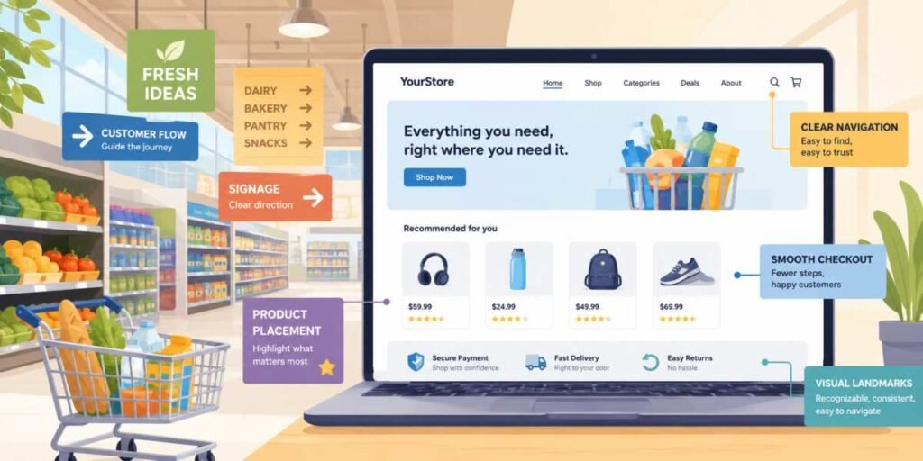
Supermarkets rarely place products randomly. The layout guides customers through a carefully planned route. Fresh produce often greets visitors at the entrance because colorful displays create a positive first impression. Essential products are frequently located deeper inside the store, encouraging shoppers to pass additional merchandise along the way.Websites benefit from the same principle. Visitors should encounter important information in a logical sequence. A homepage should quickly establish value, build trust, and lead users toward meaningful actions. If critical information is buried behind confusing menus, the experience resembles searching for milk in a store where every aisle has been labeled “Miscellaneous.”
Good customer flow does not mean trapping people. Nobody enjoys feeling herded like a confused goat in a loyalty-card experiment. The goal is to reduce friction. A visitor should understand where they are, what they can do next, and why that next step matters.
Product Placement Has a Digital Twin
Supermarkets place high-margin or popular items at eye level because visibility affects decisions. Cheaper or less promoted items often sit lower or higher, where only determined shoppers and unusually flexible people tend to look.On a website, eye-level placement becomes screen priority. The most important message, offer, or action should appear where users naturally look first. This does not mean every button must shout in neon. It means the page should respect attention as a limited resource.
Featured products, testimonials, pricing links, and calls to action need deliberate placement. A website that hides its best offer near the footer is like a supermarket putting fresh bread behind the cleaning supplies. Someone might find it eventually, but by then they may have bought crackers elsewhere.
Signage Reduces Decision Fatigue
Walk into a well-organized supermarket and signs immediately answer important questions. Dairy. Bakery. Frozen Foods. Household Supplies. Shoppers do not need a treasure map or a consulting team to locate cereal.Website navigation serves the same purpose. Clear menus, descriptive labels, and sensible categories help visitors move confidently through content. When navigation becomes overly creative, usability often suffers. A menu item labeled “Discover Possibilities” may sound impressive in a brainstorming meeting, but many visitors simply want to know where the pricing page is.
Strong navigation is not exciting, and that is exactly why it works. The less effort users spend interpreting labels, the more attention they can devote to evaluating products, reading content, or completing purchases.
Consistency is equally important. Supermarkets do not move the bread aisle every Tuesday to keep customers alert. Likewise, website menus should remain predictable from page to page.
Cross Selling Without Becoming Annoying
Anyone who has reached a supermarket checkout has witnessed the art of strategic temptation. Candy, magazines, batteries, and snacks occupy prime locations because customers are already committed to making a purchase.Websites can apply similar principles thoughtfully. Product recommendations, related articles, complementary services, and upgrade options can increase engagement and revenue when presented at the right moment.
The key is relevance. Recommending a camera bag alongside a camera purchase makes sense. Suggesting a lawn mower after someone downloads a tax guide creates confusion and raises questions nobody wants to answer.
Effective cross-selling feels helpful rather than intrusive. Visitors should feel guided, not ambushed.
Creating Visual Landmarks
Large supermarkets use visual cues to help shoppers orient themselves. Distinct departments, colors, displays, and signs create recognizable reference points throughout the store.Websites benefit from visual landmarks as well. Clear headings, recognizable icons, consistent layouts, and logical page structures help users maintain a sense of direction. Without these cues, visitors can quickly become disoriented.
This issue becomes even more important on larger websites. Hundreds of pages may exist, but users should never feel lost. Every page should provide clues about location, purpose, and available next steps.
A visitor who constantly asks, “Where am I?” is unlikely to become a customer. They are more likely to become a former visitor.
Removing Obstacles From the Checkout Lane
Supermarkets understand that the buying process should be as smooth as possible. Long lines, confusing payment procedures, and unnecessary delays frustrate customers and can even cause abandoned purchases.The same principle applies online. Checkout processes should be straightforward, fast, and transparent. Every extra form field, mandatory account requirement, or unexpected fee introduces friction.
Serious usability studies repeatedly show that complicated checkout experiences damage conversion rates. Visitors who have already decided to buy should not face an obstacle course worthy of a game show finale.
Simple forms, clear pricing, visible security information, and streamlined payment options help maintain momentum from interest to purchase.
Aisle Be Back
The most effective websites often borrow ideas from environments that have spent decades refining customer behavior. Supermarkets understand movement, visibility, organization, and decision-making at a practical level. Their lessons extend far beyond shelves and shopping carts.When website owners focus on customer flow, strategic placement, clear navigation, visual landmarks, and friction-free purchasing, they create experiences that feel natural and efficient. Visitors spend less time hunting for information and more time taking meaningful action. That is good for users, good for businesses, and good for anyone who would rather find what they need without feeling like they accidentally entered a maze designed by a committee.
Article kindly provided by nulamedia.co.uk