Technology companies adopt the same blue gradients. Coffee brands lean into earthy tones and hand-drawn illustrations. Luxury firms discover minimalist black-and-white layouts as if they have unearthed a lost civilization. Entire industries begin to resemble family reunions where everyone accidentally bought the same outfit.
This phenomenon is not usually caused by a lack of talent. Designers, marketers, and brand leaders are often highly capable. The problem is that they are exposed to the same competitors, the same trend reports, and the same examples of what is considered successful. Over time, familiar visual conventions start to feel safe, and safe choices tend to multiply.
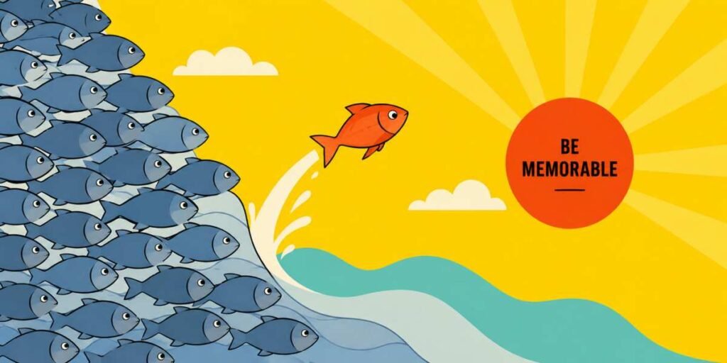
The result is what many designers call a “sea of sameness.” Brands become increasingly difficult to distinguish from one another, even when their products, values, or customer experiences are genuinely different.
Why Design Tropes Spread So Easily
Design conventions rarely appear out of nowhere. Most emerge because they work. Certain colors communicate trust. Certain layouts improve usability. Certain styles align with audience expectations.Problems arise when useful conventions become unquestioned rules.
A cybersecurity company might feel obligated to use dark backgrounds, glowing lines, and abstract digital grids because every competitor does the same. A wellness brand may believe soft beige palettes and delicate serif fonts are mandatory. At some point, the original reasoning disappears and only imitation remains.
When enough brands follow the same formula, differentiation suffers. Customers may struggle to remember who is who because every website, advertisement, and social media graphic blends into a single visual category.
Sometimes the only memorable thing left is a logo sitting in the corner like a name tag at a conference.
How to Identify Overused Visual Conventions
The first step toward standing out is understanding what everyone else is doing.Conduct a visual audit of competitors and adjacent brands. Gather websites, packaging, advertisements, social media posts, and presentations. Instead of evaluating quality, look for repetition.
- Which colors appear most often?
- What illustration styles dominate the category?
- Are similar photography techniques appearing everywhere?
- Do layouts follow the same structure?
- Are identical buzzwords influencing visual choices?
The goal is not to reject every common element. Some conventions exist for practical reasons. Instead, identify areas where visual repetition has become so widespread that it no longer communicates anything meaningful.
Those areas represent opportunities.
A useful exercise involves removing logos from a collection of competitor materials. If multiple pieces become difficult to identify, that category may be suffering from a serious case of visual cloning.
Looking Beyond Your Industry for Inspiration
Many designers search for inspiration by studying competitors. That can be useful, but it can also become a shortcut to producing more of the same work.Fresh ideas often emerge when inspiration comes from unexpected places. A financial services brand might learn something from museum signage. A software company could borrow principles from magazine design. A restaurant might find interesting approaches in sports branding or vintage travel posters.
Looking outside your category expands the range of visual solutions available to you. Instead of asking, “What do other companies in our industry look like?” ask, “What visual approaches communicate our personality most effectively?”
That subtle shift changes everything.
It also reduces the risk of accidentally creating a website that looks suspiciously similar to twelve competitors and one cryptocurrency startup that vanished six months ago.
Standing Out Without Wearing a Neon Spacesuit
Differentiation does not mean abandoning common sense.Some brands discover the dangers of forced originality when they become so determined to look different that usability, clarity, and credibility are sacrificed. Being memorable is valuable. Being memorable for confusing people is less impressive.
Strong differentiation usually comes from thoughtful decisions rather than dramatic ones.
A distinctive color palette, an unusual illustration system, a unique photography style, or a recognizable approach to typography can create separation without making audiences work harder to understand the message.
The most effective brand identities often feel inevitable once they are established. They look fresh because they are rooted in strategy rather than trends.
Design trends come and go. Strategic differentiation tends to last much longer.
Making Waves Instead of Following Them
Escaping the sea of sameness requires curiosity, discipline, and a willingness to challenge assumptions. It means studying conventions closely enough to recognize which ones deserve to stay and which have become visual autopilot.Brands that stand out rarely achieve that status by chasing novelty alone. They earn attention by expressing something authentic in a distinctive way. The objective is not to be louder than everyone else. It is to be clearer, more recognizable, and more memorable.
When competitors continue marching in the same direction, the strongest opportunity may not be to run faster. It may be to choose a different route altogether and give people a reason to remember where it leads. When enough brands follow the same formula, differentiation suffers.
Article kindly provided by jakejbryant.com