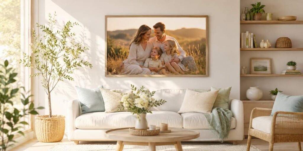
That difference is not just about who is in the image, how expensive the camera was, or whether everyone managed to keep their eyes open at the same time. A portrait becomes display worthy when it behaves like part of the home. It has structure, rhythm, colour, scale, and mood. It does not simply record a face; it earns its place beside the sofa, above the fireplace, along the staircase, or in that awkward hallway space that currently contains one lonely light switch and a vague sense of regret.
Composition That Gives the Eye Somewhere to Rest
A strong wall portrait usually has a clear visual centre. The viewer knows where to look first, then where to move next. This matters because framed photographs compete with furniture, lamps, plants, shelves, books, and, in some homes, a decorative bowl no one is allowed to touch.Good composition creates calm. Faces may sit slightly off-centre, bodies may form soft triangular shapes, or the background may leave breathing room around the subject. Negative space is especially useful for wall art because it stops the image from feeling cramped. A tightly cropped photo can work beautifully on a phone screen, but enlarged above a sideboard it may feel as if Uncle Rob is leaning into the room to ask whether the kettle is on.
Albums and digital galleries can tolerate more variety. They are perfect for close-ups, funny expressions, action shots, and smaller emotional details. Wall portraits usually need a little more order. They should still feel alive, but not so busy that they start arguing with the wallpaper.
Balance That Matches the Room
Balance is one of the quiet reasons certain photographs feel expensive, even when no one can explain why. A balanced portrait does not mean everyone is lined up like they are waiting for a school bus. It means the visual weight feels intentional.A large group can be balanced by careful spacing. A single person can be balanced by a doorway, tree, window, chair, or soft shadow. Even the direction someone is looking can affect balance. If a subject faces into open space, the image often feels thoughtful and composed. If they face out of the frame, the photograph may feel restless, as though they remembered the oven was on.
For home display, balance also depends on the room itself. A minimalist room may suit a simple portrait with clean lines and gentle tones. A lively, layered interior can often carry richer colours, movement, and busier backgrounds. The photograph should feel like it belongs in the space, not like it wandered in from a different house and is trying to act casual.
Scale Makes a Bigger Difference Than Most People Expect
Many photographs look wonderful on a laptop screen yet lose their impact when printed at a larger size. Others barely attract attention as small prints but become striking centrepieces once given room to breathe. Understanding scale before the shutter is pressed can dramatically improve the finished result.Portraits intended for large wall displays generally benefit from cleaner compositions. Too many tiny background details can become distracting when enlarged. Strong shapes, confident posing, and clear separation between the subjects and their surroundings help an image remain effective whether viewed from across the room or just a few feet away.
It is also worth considering where the finished piece will hang. A narrow hallway often suits a vertical composition, while a wide living room wall may call for a landscape format. Planning with the final display location in mind allows the photograph to complement the architecture instead of fighting against it.
Lighting Creates Atmosphere Long Before Anyone Notices It
Lighting is often the first thing people feel without consciously identifying it. Soft, even light produces a welcoming atmosphere that works beautifully in family homes. Gentle window light, open shade, or the warm glow of late afternoon can flatter skin tones while creating depth and dimension.Harsh light can certainly be used creatively, but it is often better suited to editorial or dramatic work than portraits destined for everyday living spaces. A photograph hanging in the dining room should invite people in rather than make them wonder whether someone is about to interrogate the family over Sunday lunch.
Consistent lighting across a collection of framed photographs also helps create visual harmony. Whether displaying three portraits or thirty, similar lighting styles allow the collection to feel connected rather than assembled by complete accident over fifteen different holidays.
Colour That Works With the Home Instead of Against It
Colour choices influence far more than clothing. They affect how comfortably a photograph settles into a room over the years. Earthy neutrals, soft greens, blues, creams, and muted seasonal tones tend to remain timeless because they blend naturally with a wide range of interiors.That does not mean every portrait should be understated. A bold splash of colour can become a beautiful focal point when used deliberately. The key is avoiding combinations that dominate the room for all the wrong reasons. Today’s fashionable neon trend can become tomorrow’s “What were we thinking?” moment surprisingly quickly.
Background colours deserve just as much attention as wardrobes. A carefully chosen location often provides subtle colour relationships that help the entire image feel polished without anyone immediately knowing why.
Framing Memories Without Boxing Them In
The photographs people continue displaying year after year rarely succeed by accident. They combine thoughtful composition, balanced design, appropriate scale, flattering light, and colours that feel at home within the spaces where life actually happens.When those principles come together, a portrait becomes more than a record of a particular day. It becomes part of the character of the home itself, quietly reminding everyone who walks past of the people, relationships, and moments worth celebrating. Rather than disappearing into an endless stream of digital files, these photographs continue earning appreciative glances every single day, proving that good design does not shout for attention. It simply makes people want to look again.
Article kindly provided by missymayophotography.com